So as you know, I’ve been spending a lot of time on theming over the last few weeks and this is not just a mere customization of CSS. To get that beautiful acrylic effect, I have to do substantial code changes and because it is a large project, it takes time to update all of the individual components while fully automating the process.
Of course, R&D and testing is another story. I have re-written the code that produces the acrylic effect several times while trying to avoid graphical glitches (as mentioned in my previous post).
So the good news is, I finally streamlined it enough and brought it down to a single API call to get that acrylic appearance. This means, the only thing that each component needs to do to get the acrylic effect is call one function (method actually, to be technically correct), and pass itself by reference to that method and the rest is taken care by the method automatically. Very neat and clean and easily adoptable to any Orbitiny Desktop component.
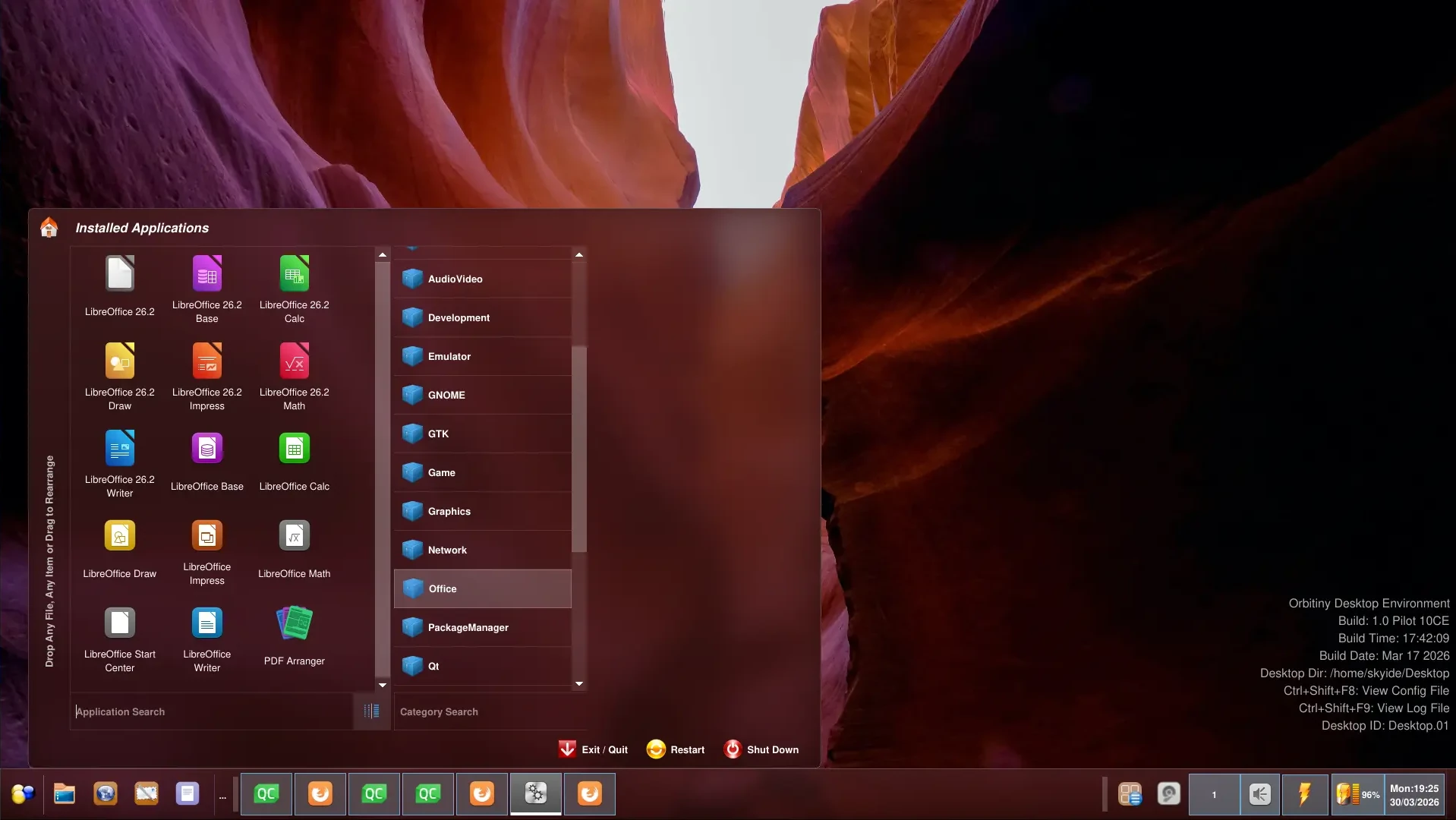
Here is the same menu for a comparison when the effect is not applied:
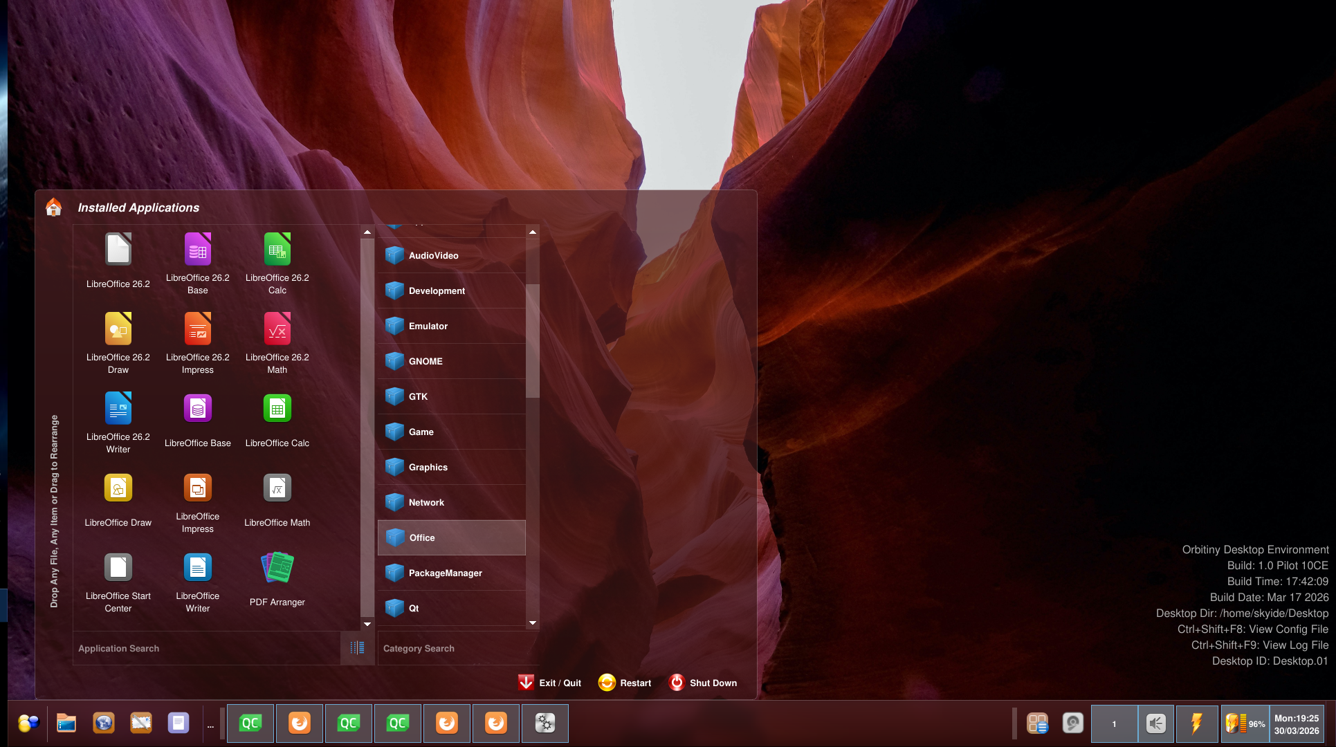
Very glossy (or glassy) if you will. So as you can see, there is a drastic difference in appearance. For this to work, you must apply transparency to the window making the call and make it frameless (remove the window decorations).
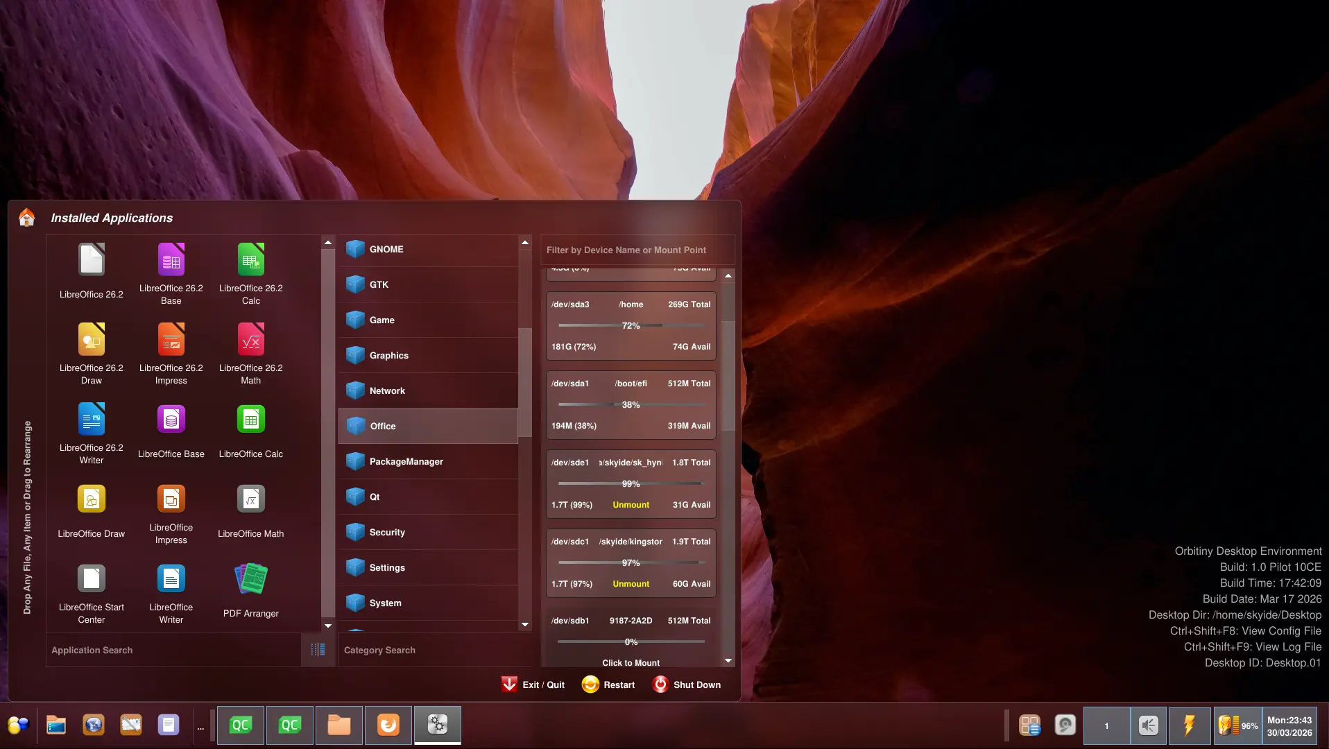
Don’t worry about the third pane being blank (the disk manager pane), this is a development screenshot so it’s been removed deliberately due to another thing that I am doing in parallel – code clean ups. No, I am not “cleaning up” the code by removing features 🙂 I am not like that.
That pane normally contains the disk manager view but this component already exists elsewhere as a module. The file manager already makes use of that module. It is the “Disk Manager” tab in the sidebar and all I need to do to bring it back in the menu is attach the module and the rest is taken care by the module.
Another idea is to add links such as “Documents”, “Pictures”, “Downloads” etc in that pane instead. Personally, I don’t use the third pane but I know some of you may like it so I am thinking of making it customizable so that you can switch which view you want, the disk manager view or have Documents, Pictures etc instead.
I look forward to this new version, it will look great.
Also, the color tone is no longer bound to the wallpaper in use. I found it problematic. It was a neat idea but no…You will have options to apply different color tones (including a grayish tinge or aquatic blue – my favorite etc).
UPDATE: The device view is back in the third pane, here is another screenie for you 🙂 Not all components have received the new look but they will.
More updates are on the way, the hardest part is done.